Showing posts with label covers. Show all posts

Tuesday, November 24, 2020

More Tolkien Covers

Last time I posted Barbara Remington's Lord of the Rings covers for Ballantine. Those were the first versions of Tolkien's books I read. They were my dad's and they eventually fell apart. When I bought a new set, they had covers featuring paintings by Tolkien. As much as I love Remington's on-the-nose sixties art, I prefer Tokien's. I love his art nouveau-influenced style and the rare chance to see an author's actual vision put to paper. I'm still looking for good shots of more of his art to post, but these four covers will do in the meantime.


depicted: Bilbo and the dwarves escaping the Elf King's hall


depicted: Hobbiton

depicted: Fangorn Forest

depicted: Barad-dûr


Thursday, April 5, 2018

Covers from Another Unread Classic: Saberhagen's Empire of the East

Another one of the books everyone I knew growing up read and loved and that I never got around to myself is Fred Saberhagen's Empire of the East. Presented as a single, big book, it's really an omnibus comprised of three novels: The Broken Lands (1968), The Black Mountains (1971), and Changeling Earth (1973). I even bought a copy some years ago, but I lost it or traded it in or something or other. Whatever happened, I don't have it anymore. Well, until yesterday when I grabbed a copy in THE GREATEST USED BOOK STORE IN THE WORLD (which I'll talk about later). 

I started reading it almost at once, and so far it's great. Very iconic stuff -- young boy, family murdered by villains, mentoring wizard, etc. Saberhagen isn't the most poetic of writers, instead writing in a clean, contemporary style. It's appropriate for a story that isn't pure fantasy, but one set in a post-apocalyptic super-science and magical setting. 

The Broken Lands


The Black Mountains


Changeling Earth


 Empire of the East


Tuesday, June 28, 2016

Awesome Swords & Sorcery Covers II: Eternal Champions

I probably read more Moorcock when I was a teenager than any other writer. I really have no idea how many times I read the various Eternal Champion series. In addition, I read the Dancers at the End of Time series, and various stand alone novels. I particularly liked the Nomads of the Time Stream and their proto-steampunk setting, even if I didn't get all the political, literary, and cultural references. I'm not sure how many books by Moorcock I've read, but I suspect it's around thirty.

I must write, with some sadness, that recent visits to Moorcock's literary landscapes have been a little disappointing. While there's a wild originality to his stories, there's also a sense of playacting that undercuts much of the drama. When Conan growls and swears a mighty oath I buy it. When Elric does the same thing, I don't, and it's because I don't think Moorcock does, let alone can. For all his love of Edgar Rice Burroughs, he's too much of a modern aesthete to really submerge himself in the bloody sinew and gristle of heroic fantasy and let himself go.

While in better hands it wouldn't be a problem, Moorcock seems to have been unwilling to just tell a story. His stories always seem written to make some larger point; humans are destructive and untrustworthy (Corum and The Eternal Champion), the UK's demented and evil (Hawkmoon), and that good and evil are simplistic notions (nearly everything). These are neither deep nor original thoughts, nor does he dig too deeply into them (it's hard to deep thoughts into a slim book when it's already packed with tons of plot). That's not immediately apparent at fifteen, but it is at fifty. There is a thick strand of pedantry that rings too loudly of the waking world, and detracts from the dream world of the story.

Be that as it may, Michael Moorcock's stories still manage to hold a dear place in my heroic fantasy mental landscape. There are few characters more vivid than Elric, Corum, and Dorian Hawkmoon. I still want Jhary-a-Conel's cat, Whiskers, and a friend as loyal as Moonglum. To not read the those three series is to deprive oneself of some of the most original and important writing in heroic fantasy. All those flaws I've found might only be the result of diving into these stories too many times, and becoming too familiar with them, gaining too much insight into the mechanics and the stagecraft. There's so much good stuff in his books that will linger in my mind and outlast any disappointing rereading for a very long time.

Here is a selection of the covers of his books that thrilled me most. Looking at them today, they conjure up not only the stories, but the time when I first read them, discussing them with my friends, and then starting all over and reading them a second and third time.


These six covers by American artist David McCall Johnston are my favorite covers of my favorite books by Michael Moorcock. I just plowed through a lengthy and highly disapproving review of the two series over at Ferretbrain. Many of the critic's points mirror my own, but he clearly had much less tolerance for the books' problems. 

I like the contrast of an essentially realistic Corum against stylized backgrounds. It's as if the flesh and blood Prince in the Scarlet Robe is entering a dreamscape, where nothing is quite tangible, be it a field of leaves, waves, flame, or dust. As he spends much of the first trilogy in the ever changing realms of Chaos and the second in magical locales,this seems a reasonable interpretation. 

I'm struck by the color choices. On each cover, red is what draws the eye, whether it's Corum's crimson robe or Xiombarg's Medusa-like hair. The colors are bold but not bright. As much as they draw your eyes in, they aren't harsh or jarring. Again, they have the soft muzziness of a dream, not the razor-clean edges of a photograph. Definitely not covers you see on today's shelves.


Painted by Richard Clifton-Dey, these covers for the First Chronicles of the Runestaff are weird and bad. They are incredibly realistic, but also incredibly stiff and lifeless. The lizard heads on the last two covers appear drawn from real life, but with the tacked on wings and tentacles, they seem as believable as the poor lizards with glued on fins in Irwin Allen's dinosaur movies. Nonetheless, I dug these books, and still have a fondness for them. Sure, he cranked them out like he was on crank, and wrote them for the money, but they are chock full of madness and gonzo images: war flamingos, imperialists all wearing bejewelled animal mask, a withered emperor kept alive in a crystal womb by super science. Pretty awesome stuff. These are editions I first read and the ones that stuck most deeply (and still do) in my brain.


I haven't included the Michael Whelan Elric covers because I already highlighted them a little bit in past posts. I also discovered I was a lot kinder to Moorcock's books than I am today. It's just one those things, I guess. Tastes and attitudes change and there's not much you can do about it, even in as short a time as two years. 

Tuesday, May 10, 2016

Lo-fi Swords and Sorcery Art

To continue on the discussion started in the comments on the last post, here are some of the best lo-fi swords & sorcery art I could find in a quick scouring of the web. I'd been planning to do this, but Raphael Ordonez's comment inspired me to actually do it.
I have to like the cover if I'm going to read the book. I'm embarrassingly superficial like that. I recently saw a number of old Arkham House books for sale, and I totally would have bought them for the dust jackets, if I'd had the money, which I didn't. It's interesting what you say about the amateurishness, which I've often noticed. For some strange reason that only increases the appeal for me. It seems to go hand-in-hand with their unapologetic enthusiasm.


I see nothing strange at all about liking the "unapologetic enthusiasm." That's what gets me the most about this art. It makes no bones about being done by fans for fans without the mediation of professional marketing or focus groups. It was created by artists who love monsters, heroes with big honking weapons, mad sorcerers, and exotic, dangerous worlds and know that's exactly what we S&S fans love as well. 

Other than pictures my friends or I drew, the earliest fantasy artwork that stuck in my brain were from the original D&D pamphlet my friend Densel E. used to teach us how to play. I was only eleven or twelve, so I didn't understand they were "crappy," I just knew they were cool. And I still do.

I don't hate covers that don't take the lo-fi road, not at all. There's just something cool about illustrations that don't try to include every detail, and every shade mentioned in the text. Instead, they present a picture that's impressionistic, capturing the feel and intensity of what it's depicting but leaving the details for my brain to fill in. 


Several people have told me that the awful photshopped art endemic to modern fantasy covers are what have been proven to sell. Even though the many of these covers still contain some of the standard fantasy elements (swords, magic blasts, etc.), they seem like they're reluctant to embrace the genre. They seem to reject the pulp roots of fantasy, instead striving to look more mainstream. I get it, but I just don't like it. These pictures, I like. Can you imagine any of these being in a gaming supplement or on a cover today?


Thursday, March 6, 2014

King Kull Kovers

King Kull never got the illustrated love Conan received. It's a shame because there's a lush, liana-drapped decadence I associate with the Kull stories that I think would lend themselves to the sort of art folks like Frazetta and Kelly specialized in. Still, there've been so decent to excellent covers over the years.

One of the first and easily my favorite. It captures Kull's balancing act between his savage heritage and Valusia splendor. Plus - serpent man in background with bat/monster.


I'm not a big fan of Achilleos and this only increased my lack of love for his work. The gore doesn't bother me, it's the creepily muscled torso.


 Yeah,....this just isn't good at all.


It's alright. Kelly's one of the best Conan artists but this doesn't quite work for me. Kull's a little too Conanesque for me. I don't know, I expect more than a fur loin cloth. And his right hip's oddly proportioned.


These are my second and third favorites. Murderous serpent men in the first, a battlefield declaration in the second, in both illustrations Kull looks just right. 

I won't, because a) I've got too many other things to be read, b) I'm lazy, but just looking at these pictures really makes me want to read the stories again. Or at least wish the Kull movie didn't stink to high heaven.

Friday, February 14, 2014

Cool Covers for Books I Never Read


   So these books run a very high risk of stinking but I remain curious. The thing is, my dad was as big a fan as any one could be of Carter's books and had these two in one of those attic boxes I alway mention. and they always caught my eye. The Black Star is probably one of my favorite Frazetta pictures. I've got a lot of stuff I'm hoping to get to this year but I think I need to pull these out of the attic and put them on the TBR stack.


Thursday, February 6, 2014

Dread Empire Covers over the Decades

So I've triggered a Glen Cook-athon for myself. First I blog about his short stories, now I'm preparing to delve into the Dread Empire series (not the two El Murid books. I've read them in the past five or six years). I might even hit the Black Company books later this year.
So here are the covers of all the Dread Empire books as they were first published and as Night Shade republished them thirty years later. Really not a lot of good stuff except for the two Night Shade omnibuses, A Fortress In Shadow and A Cruel Wind.

There's definitely a pulpier sensibility to the earlier books. The newer covers, while clearly genre books, have a similarity to the WotC-era D&D stuff and computer game boxes. There's a certain homogeneity to too much modern "geek culture" products and these feel of a piece with that. Not to my tastes, but the new covers definitely make the books look like they're of this age and not three decades ago.


The original covers for the El Murid books. The originals really are not that good. There's a dullness to them, especially for The Fire In His Hands. The cover for the later omnibus is by Raymond Swanland and is much more vivid.

The first three are covers I've griped about before. A Shadow of All Night Falling has characters who look unfinished. October's Baby, well, I'm just going to say look at it yourself. All Darkness Met isn't that bad. I don't really love the look of Bragi Ragnarson but the princess and the tiger in the background give it a nice pulp feel. Swanland's cover for the A Cruel Wind omnibus is, again, vivid and bold and provides a nice hint of the epic awesomeness of the battles against the Dread Empire.


Well, what can I say? I can say the original covers to the left stink. There's no excuse for them unless lunatics were in charge of the art department. Now those are by Ken Kelly, artist of some of the best REH covers but here his style is awful and a total disservice to the books.

On the other hand, Swanland's work for the gaming industry comes through loud and clear in his covers on the right and I don't like them either. There's too much stuff/gear/accoutrements on the characters and I find the armor too busy. They're not all that different from the other Dread Empire covers he did but I find myself irritated by these.


These exist only with Swanland covers. Not having read A Path to Coldness of Heart my reaction to this is purely visual. I don't like the big brain guy, nope, I just don't like him. My complaints about Empire are the same as about the previous two Swanland covers - too gamey. I'm also pretty sure no image like that ever even occurs in any of the stories. 

In the end, I don't buy books based on the cover (oh, that we could). Presumably the art's chosen to help move copies of the book. While I'm not a fan of much of the new fantasy cover art I'm no expert on what sells and what doesn't. But I can complain, and that I'll keep on doing. 

Monday, November 26, 2012

More (Moorcock) Covers That Awed Me.

   So many of the books I read as a kid I discovered in cardboard boxes my dad kept in the attic (eleven years after his death most of the paperbacks we essentially co-owned are still there).  I can't remember at what age I started dipping into those boxes but I can remember the feeling of wonder I got when I did.  From Asimov to Zelazny with all stops in between.  There were (are) probably thousands of books in those ancient boxes.  Rockets and wild aliens or brooding swordsmen and bat-winged monsters overhead held the promise of excitement and adventure.  At an early artists like Kelly Freas, and Vincent Di Fate were helping shape my imagination's landscape.
   Like so many readers, I suspect, when presented with a slew of unfamiliar books, we grab the one with the cover that grabs us first.  I don't do that much anymore, but in my youth, boy, oh, boy is that what I did.  Two of the strangest covers I found in the attic were for Lancer Book's Elric books; "The Dreaming City" and "The Sleeping Sorceress".


   These covers, a vibrant collision of psychedelic colors and a weird, almost rotoscope effect were like nothing else (well, maybe the whacked out Ballantine "Lord of the Rings" covers) in the attic.  First there's the girl with the Medusa hair on "Dreaming City" and then the one with the multi-hued afro on "Sleeping Sorceress" to catch your eyes.  Both are staring straight at the reader with alien eyes and arms and wrists held in odd, unnatural poses.  I doubt the dusky-skinned Elric matches anyone's imagined Elric but he and his dragon-winged helmet still demands your attention.  The rainbow plumage of the the winged skull on "Sleeping Sorceress" is beautiful.  The strangeness of the covers turned out to be a perfect match for Moorcock's strange, off-kilter S&S.
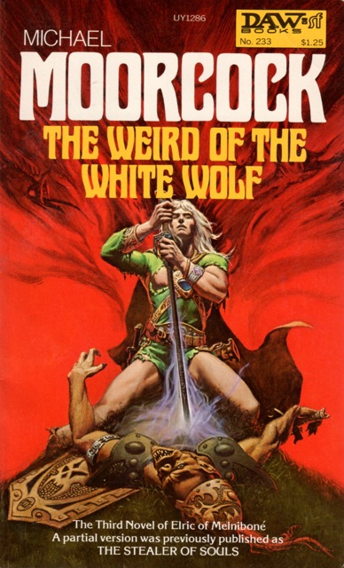
   Fortunately I started reading Elric at the same time DAW started publishing them.  Several trips to Paperback Booksmith in the Staten Island Mall rewarded me with all six original novels.  Michael Whelan's cover art is some of the best in the genre, striving for realistic characters set in believable, fantastic surroundings.  Five of the covers are great (let's all agree the pig-faced corpse ruins "The Weird of the White Wolf").  It's the final one, "Stormbringer", that is a monster.  I don't love the pteranodon dragon in the corner, but, dang, that's a fine, over the top and side-of-the-van worthy Elric.  Stormbringer overhead and Horn of Fate trailing behind, Elric's charging head on at the reader with a perfectly psychotic glint in his bloody red eyes.  I didn't know the apocalyptic story awaiting me inside that book but its cover portended dangerous craziness.  


   I am a little sad that in this day and age of e-books I don't care about covers as much.  I'm not buying in used-book stores, let alone Barnes & Noble, like I used to so the eyecatching ability isn't that relevant.  I know what I'm buying ahead of time with almost every book purchase these days.  I've read the reviews, gotten the recommendations and heard the podcast with the author.  It's the same thing with music.  I can barely recognize the covers of the last MP3 album I bought but the cover of my friend's brother's copy of "In the Court of the Crimson King" is still seared into my mind.  
   I love my e-books and I don't miss the feel of a book and turning pages.  That's because it's the words that I hold dear.  But I will miss the art, and I believe the day's coming when it will pass away into the e-ink ether, one more lost element of analog times.

Saturday, August 4, 2012

Covers That Awed Me (and still kinda do)

   One of the reasons I picked up a lot of books when I was a kid was because of their covers.  My dad had hundreds of sci-fi and fantasy paperbacks in the attic.  He rarely recommended anything to me (except for LOTR), leaving me to discover authors on my own.  Often it meant going for the coolest, most exciting cover in the box.  Later when I bought my own books from spinner racks in the Staten Island Ferry Terminal or Barnes & Noble, eye catching covers helped in sorting through the vast selections.

   These covers are among the most vivid from my childhood and teenage readings in swords & sorcery.  Clearly the late Frank Frazetta's talents had a lot to do with shaping the visual presentation of S&S in the era.  It's easy to see why.  It's big and brutal with dark, brooding figures committing or at least contemplating great acts of violence.  Not to get too psychological but the appeal of the powerful characters he painted have a strong pull for the typical teenage guy bursting with energy and testosterone who feels like he's indestructible while feeling at deep odds with the world.  Or maybe teenage boys just like big honking barbarians swinging swords, cleaving monsters and getting the girl 'cause it looks cool.


   These covers still overwhelm my senses in the best possible way when I look at them.  They possess none of the photo realism of so many modern covers, a style I really dislike (they look like bodice-rippers).  Instead, with "Conan the Warrior" we get swirling flames and smoke and flailing Picts caught in mid strike.  There's an impressionism in Frazetta's art that does more to conjure Conan and his ilk than any host of photo shopped book cover models.  
   "Flashing Swords! #2's" second cover (this one replaced a weaker Frazetta cover on the first printing) brings us Frazetta's original "Death Dealer" in all his malefic glory.  His eyes burn as brightly as the fire in the background and are as crimson as the blood dripping from his oversized axe.  Above swoop vultures which surely travel in his wake awaiting in anticipation of their next meal. 

   I find a dream quality in paintings as well a feeling of motion conveyed by the blurred shadows and body contours.  There's none of harsh unreal realness of CGI animation.  "Conan the Warrior" may depict one moment of combat but it doesn't feel like a snapshot but a frame from a film unreeling in my head.

   "Death Angel's Shadow" is minimalist next to the Frazetta pictures.  It was done by an artist named Stan Zagorski who looks like he's mostly done album covers.  In this one picture he captures Karl Edward Wagner's "mystic swordsman" like none of the subsequent covers by Frazetta did.  
   The latter picture a bare-chested barbarian with a red beard.  Zagorski's Kane is a man in full armor in an almost relaxed pose despite looking as if he's in the midst of a fight.  Behind him rises what I'm guessing is his cloak formed into skulls.  Where Kane treads, murder and bloodshed trail him.
   Because of e-books covers don't influence my impulse buying as much and limited shelf space means I won't just get a book to get a book anymore.  I rarely buy books in Barnes & Noble so my eyes aren't caught up by the dazzling colors on the new releases' shelf either.  Sadly, I suspect this is true for a lot of readers.

   Does anyone else have covers stuck in their head or that helped shaped how they thought about S&S or fantasy in general (anybody else still in love with the psychedelic LOTR covers by Barbara Remington for Ballantine?)

Tuesday, December 6, 2011

Darrell K. Sweet - RIP


 Scanning Black Gate this evening I saw Darrell K. Sweet had died.  Along with the Hildebrandt Bros., Sweet created the image of fantasy for me and doubtless some many other fans from the seventies and early eighties.  His art is beautiful, detailed and evocative of my youth.
   Like I wrote about a few weeks ago, a friend of mine would buy books simply because of his covers.  I never went that far but I have no idea how many books with his covers fill the boxes of books in the attic.