
So many of the books I read as a kid I discovered in cardboard boxes my dad kept in the attic (eleven years after his death most of the paperbacks we essentially co-owned are still there). I can't remember at what age I started dipping into those boxes but I can remember the feeling of wonder I got when I did. From Asimov to Zelazny with all stops in between. There were (are) probably thousands of books in those ancient boxes. Rockets and wild aliens or brooding swordsmen and bat-winged monsters overhead held the promise of excitement and adventure. At an early artists like Kelly Freas, and Vincent Di Fate were helping shape my imagination's landscape.
Like so many readers, I suspect, when presented with a slew of unfamiliar books, we grab the one with the cover that grabs us first. I don't do that much anymore, but in my youth, boy, oh, boy is that what I did. Two of the strangest covers I found in the attic were for Lancer Book's Elric books; "The Dreaming City" and "The Sleeping Sorceress".

These covers, a vibrant collision of psychedelic colors and a weird, almost rotoscope effect were like nothing else (well, maybe the whacked out Ballantine "Lord of the Rings" covers) in the attic. First there's the girl with the Medusa hair on "Dreaming City" and then the one with the multi-hued afro on "Sleeping Sorceress" to catch your eyes. Both are staring straight at the reader with alien eyes and arms and wrists held in odd, unnatural poses. I doubt the dusky-skinned Elric matches anyone's imagined Elric but he and his dragon-winged helmet still demands your attention. The rainbow plumage of the the winged skull on "Sleeping Sorceress" is beautiful. The strangeness of the covers turned out to be a perfect match for Moorcock's strange, off-kilter S&S.
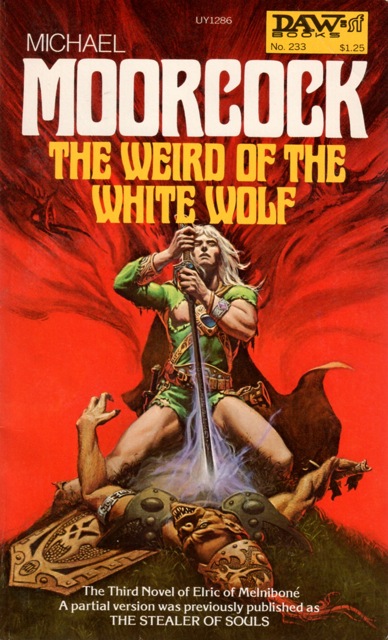
Fortunately I started reading Elric at the same time DAW started publishing them. Several trips to Paperback Booksmith in the Staten Island Mall rewarded me with all six original novels. Michael Whelan's cover art is some of the best in the genre, striving for realistic characters set in believable, fantastic surroundings. Five of the covers are great (let's all agree the pig-faced corpse ruins "The Weird of the White Wolf"). It's the final one, "Stormbringer", that is a monster. I don't love the pteranodon dragon in the corner, but, dang, that's a fine, over the top and side-of-the-van worthy Elric. Stormbringer overhead and Horn of Fate trailing behind, Elric's charging head on at the reader with a perfectly psychotic glint in his bloody red eyes. I didn't know the apocalyptic story awaiting me inside that book but its cover portended dangerous craziness.

I am a little sad that in this day and age of e-books I don't care about covers as much. I'm not buying in used-book stores, let alone Barnes & Noble, like I used to so the eyecatching ability isn't that relevant. I know what I'm buying ahead of time with almost every book purchase these days. I've read the reviews, gotten the recommendations and heard the podcast with the author. It's the same thing with music. I can barely recognize the covers of the last MP3 album I bought but the cover of my friend's brother's copy of "In the Court of the Crimson King" is still seared into my mind.
I love my e-books and I don't miss the feel of a book and turning pages. That's because it's the words that I hold dear. But I will miss the art, and I believe the day's coming when it will pass away into the e-ink ether, one more lost element of analog times.
Aw yeah!
ReplyDeleteMoorcock's novels have had some really great and pretty weird covers throughout their publication history.
A couple years ago I bought all six novels of the Corum series because of the coves by Bob Haberfield. They've go an interesting use of colors, strange imagery, and influence from Indian mythology and other unusual places (for a fantasy novel covers, that is).
A quick google will delight you, i'm sure.